Tide — Personal Finance App
A budgeting app for people who have never kept a budget, built around one number: how much you can spend today.
Overview
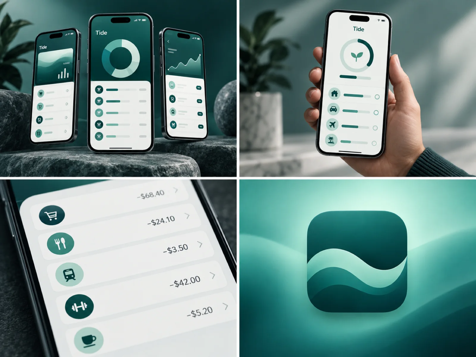
Tide is a personal-finance app for people who have never kept a budget. Most money apps open on a wall of charts; Tide opens on one question — how much can I spend today? — and builds everything else around that answer.
The problem
People told us the same thing in different words: budgeting apps made them feel behind before they had started. Categories had to be set up first, charts looked like homework, and a single overspend turned the whole screen red.
- Setup asked for decisions people could not make yet.
- Charts described the past; people wanted to know about today.
- Red warnings made people close the app instead of adjusting.
My role
Product designer from discovery to hand-off: interviews, user flows, wireframes, the visual language and the component library, working alongside a product manager and two engineers.
Process
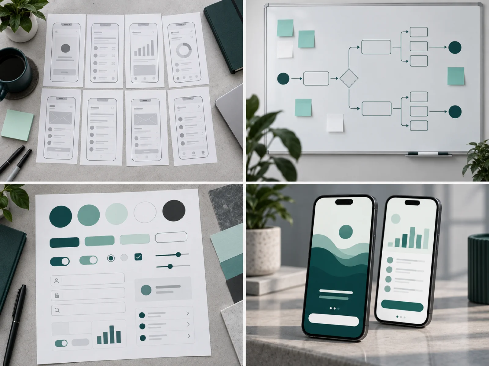
I started with eight interviews and a diary study, then mapped the first-week journey on a whiteboard. Wireframes went through three rounds of hallway tests before any colour was added, so the structure was settled before the styling.
Key decisions
- A single "safe to spend today" number at the top, recalculated with every transaction.
- Categories are suggested from real spending after the first week, not set up on day one.
- Overspending shifts the number down calmly instead of turning the screen red.
- Goals are shown as progress rings you fill, not as targets you miss.
Design system
A teal and mint palette chosen to feel steady rather than alarming, one typeface in three weights, and a component sheet of about forty parts so engineers could build new screens without a new design pass.
Outcome
Testers who had given up on budgeting apps before completed onboarding without help, and the daily number became the thing they described when asked what the app does. The component library let the team ship new screens directly from existing parts.
What I learned
The kindest design choice was also the most useful one: people act on information that does not make them feel judged.