
Kiln & Co. — Brand Identity
A warm, hand-made identity for an artisan ceramics studio, built on a kiln-arch mark that works embossed, printed and fired into clay.
Overview
Kiln & Co. is a small ceramics studio that makes tableware by hand and sells from its own shopfront and online. The owners wanted an identity that felt as warm and made-by-hand as the pottery, without looking rustic or dated.
The brief
- One mark that works embossed, printed, fired into clay and on a sign.
- A palette taken from the studio's own clays and glazes.
- A system simple enough for the owners to apply themselves.
My role
Brand designer: research, concept, the logo, colour and type system, stationery, packaging, signage and social templates.
Concept
The mark is the arch of a kiln door, drawn as nested curves that also read as a bowl seen from the side. It is built from simple geometry so it can be pressed into clay with a single stamp and still hold its shape.
The system
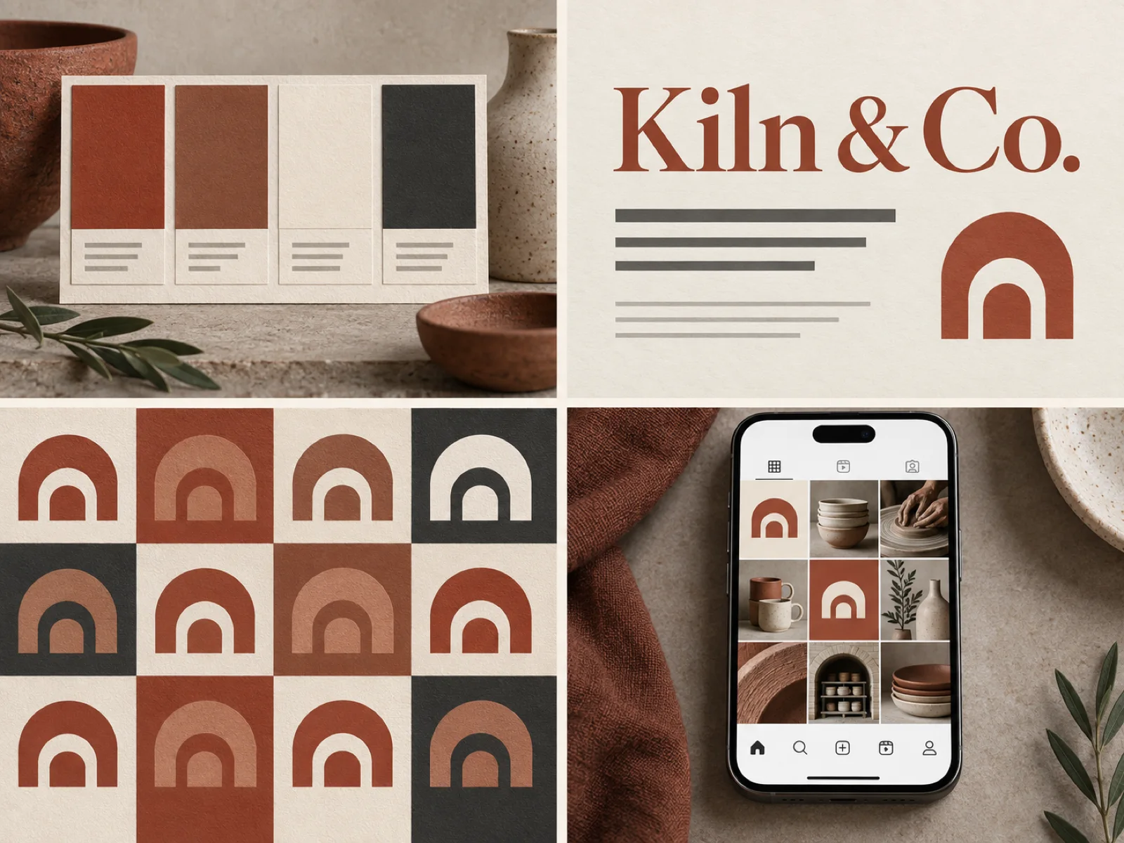
The palette is terracotta, fired clay, raw cream and charcoal — each sampled from the studio's own materials. A classic serif carries the name; a quiet sans handles everything else. The arch breaks into a family of pattern tiles for tissue paper, tape and the website.
Applications
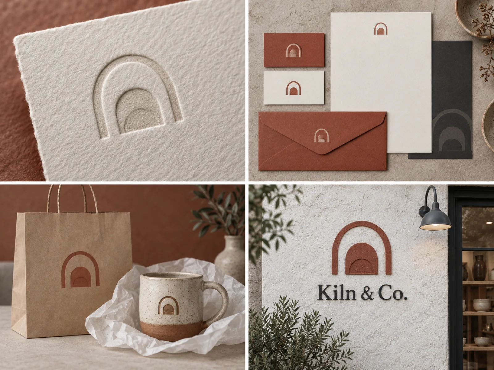
- Letterpress business cards and letterhead with a blind-embossed mark.
- Kraft bags and tissue wrap printed with the pattern.
- A hand-cut sign for the shopfront in the brand terracotta.
- A stamp so every piece of pottery carries the mark on its base.
- Social templates the owners fill from their phone.
Outcome
The owners now apply the identity themselves, from the pottery stamp to their social posts, and the shop, the packaging and the pieces finally read as one studio.